Be heard. The rebrand!
For over a century, we’ve built our reputation on trust, follow-through, and deep technical expertise. Our clients know us for rolling up our sleeves, delivering on time and on budget, and making the most of available resources. What we hear, again and again is pretty clear: “hrd gets it done—and they do it right.” We don’t need to shout to be heard.
But somewhere along the way, our brand no longer captured who we had become: a nimble, design-forward practice that prides itself on bringing common sense to complicated projects.
Embarking on a rebrand wasn’t about reinventing ourselves, it was about revealing the full picture—honoring our history while stepping more boldly into the future. We needed a new visual identity that could bridge that range—something that made space for both legacy and innovation. We wanted to express our value, and values, in a way that felt just like our work: clear, efficient, and grounded in common sense.

Stepping into the unknown.
Rebranding felt both exciting and unnerving. We’d built strong relationships under the HRD name. People knew us. And yet… we knew we needed more than just recognition. We needed resonance.
We didn’t want to look like everyone else. We wanted to own what made us different—our curiosity, our rigor, our love of complexity, and our belief that big change is possible when you bring the right people to the table.
We partnered with CVG to help us dig in and ask the uncomfortable questions, revisit our assumptions, and help us reimagine how we present ourselves to the world. What started as a branding exercise became something bigger—a strategic realignment, a recommitment to the kind of work we really want to be doing, and the clients we want to be doing it with.

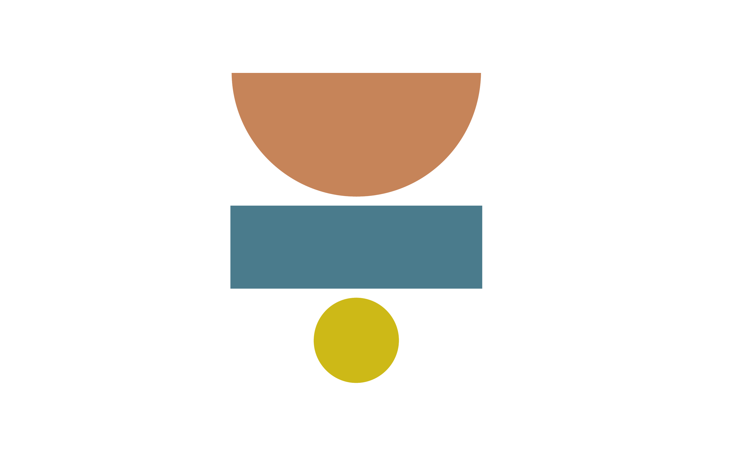
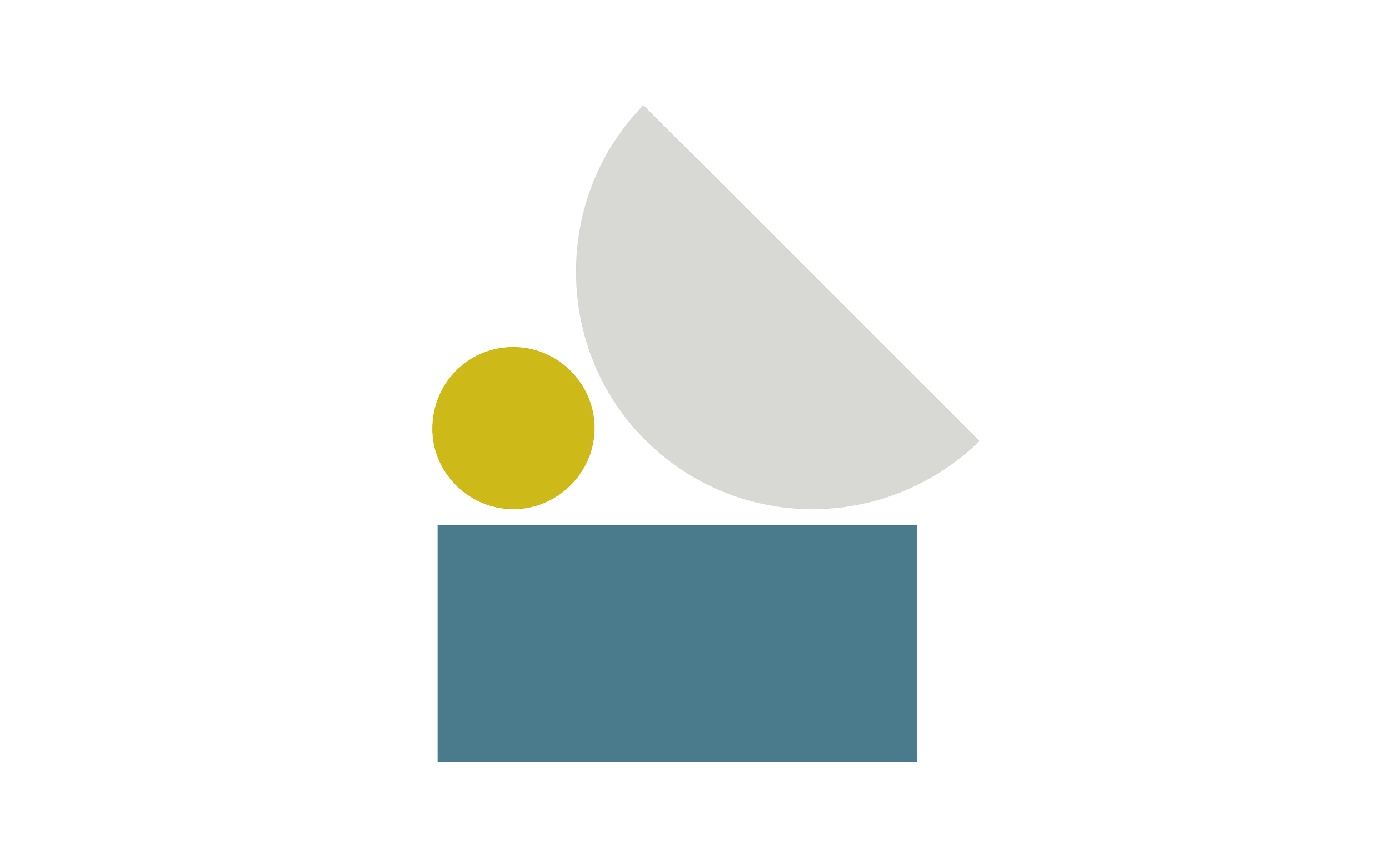
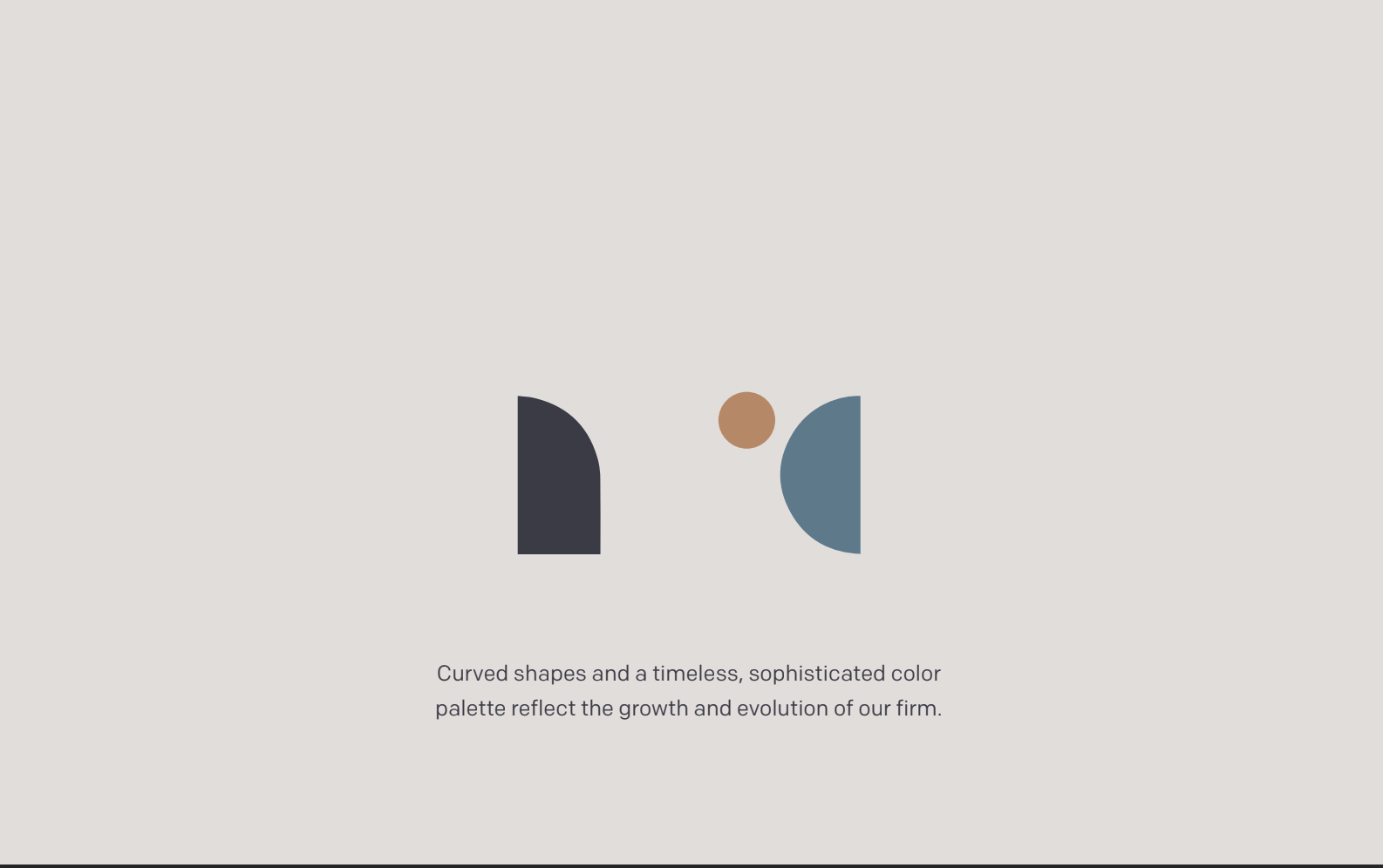
Our new brand identity is informed by old school tools of the trade. Blueprint, linen, and graphite ground a bright flash of chartreuse. Lush texture adds depth and warmth. The brandmark is based on a set of building blocks—three solid pillars that reference the firm’s history, dependability, and expertise are paired with lively curved elements—keeping our legacy alive while communicating freshness, vitality, and opening up infinite opportunities to have fun.
The new evolution.
The result is more than a new logo and color palette. It gives us a new visual language for what we’ve always believed: that design is a way of thinking, and collaboration is our method. Our new identity is bold but precise, clean but layered. It gives us space to evolve while staying grounded in what makes us, well, us.
This new brand isn’t a departure, it’s an evolution. It’s reflects how we think, how we work, and what we believe: that good design serves people—and when it’s done well, it has the power to connect and to last.
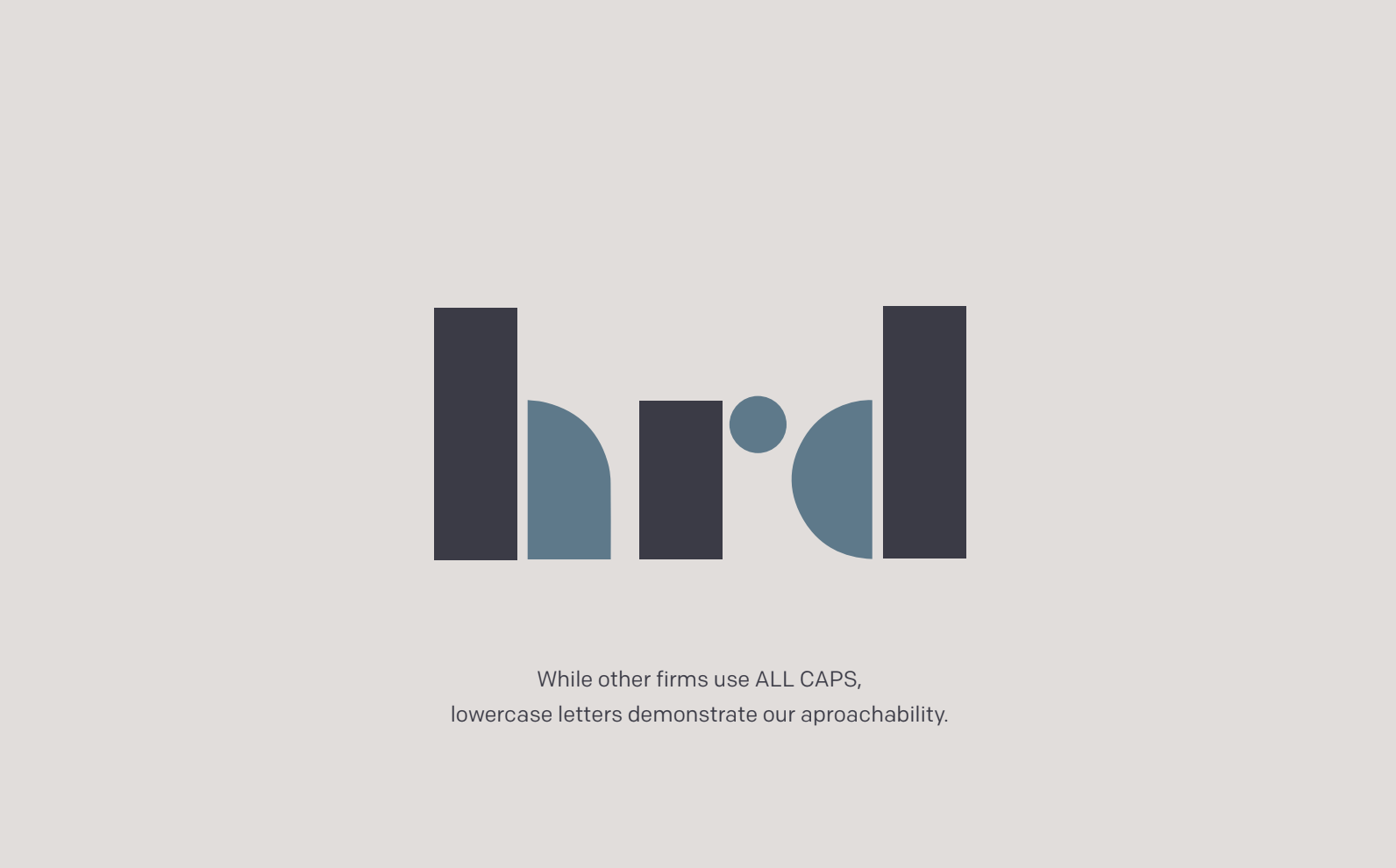
So we’re still hrd. But this version of us is clearer, sharper, and more aligned with where we’re headed next.